Pretty Pictures to Research Tool: Collecting Asylum Postcards
The primary goals of this exhibit are to introduce visitors to the history of the asylum postcard, to convey the complexity of the postcard as a research tool, and to encourage reflection on the role of asylums in community life well before the era of deinstitutionalization. The images, text, and features of the postcard are presented alongside the larger context of the asylum era and the Golden Age of postcards. The exhibit uses images from the author’s own collection with personal comments interspersed (in italics) that provide the perspective of a collector and asylum historian.
The term “asylum” will be used throughout this exhibit to refer to the institutions of the nineteenth and early twentieth centuries that were built to house people deemed "insane," to use the terminology of the time. It should be noted that the term "asylum" was also used during this period for institutions that housed other populations as well: the so-called "feebleminded," the blind, and the deaf. While the terms "asylum" and "insane" now have negative and sanist connotations, they were the terms used at the time.
A Personal Preamble: Where it all Began
I acquired my first asylum postcards when I was in grad school. My work focused primarily on the history of asylums in the nineteenth and early twentieth centuries so I would naturally pick up related items as I happened upon them: it started with a commemorative plate and later expanded to a few postcards. I did not initially see these items as part of my research nor did I consider them a part of any collection – they were simply items of interest that decorated my desk, often portraying quite beautiful and idyllic settings.
Over the years, these items began to grow in number: I added a ceramic milk pitcher, a glass milk bottle, and more and more postcards. I began to take a more active approach to finding items that connected to my subject of study. Postcards quickly became my favourite.
I began by making increasingly regular purchases through online auction sites but as the growing pile of postcards became a formal collection, my approach changed. I joined the local postcard collectors club (the Toronto Postcard Club in order to receive their publications and attended their annual sale. I began storing my postcards in acid-free archival grade sleeves and eventually moved to albums when the collection grew too large for a shoebox. And then I began to read more about the history of the postcards and started acquiring handbooks and catalogues specific to different publishers. By the time the focus of my dissertation had turned to the material culture of asylums, I was confidently calling myself a “deltiologist” (a person who collects postcards) and actively looking at my growing collection as a research tool.
My collection currently consists of several hundred asylum cards, split almost evenly between Canadian and American institutions. In light of the fact that the asylum postcard literature is focused almost exclusively on American cards, I have opted to present only Canadian cards as my examples. Outside of the specific manufacturers behind their creation and some variation in postal history, there is no significant difference in asylum postcards between the two countries.
The Rise of the Golden Age of Postcards
The postcard has a long history dating back to the mid-nineteenth century that overlaps strongly with the development of the postal service. As mail services expanded internationally, the cost of sending mail became increasingly affordable which would set the stage for the rising popularity of the postcard: a simple, rectangular piece of thick paper that could be mailed without use of an envelope.
The earliest postcards did not typically include an image. One side provided pre-printed postage that varied slightly depending on where you were sending it and the other side featured a blank space on which to record a message.
As photography and printing technologies developed, postcards began increasingly to feature a printed image on one side of the card. The opposite side was initially restricted to the recipient’s address and postage stamp forcing publishers to add a narrow white strip either to the side or bottom of the image for sender’s to record their messages. Some opted to leave no space, forcing senders to write their messages across the image itself.
In spite of these challenges, the picture postcard gave rise to what is known as the “Golden Age” of postcards, a period of time that dates roughly the 1890s until 1915 (beginning slightly later in the United States). It was an era when postcards were an international fad – billions were mailed around the world each year. People began to send postcards not only as an inexpensive method of correspondence, but as a token to friends or family while travelling. As the numbers grew, postcard collecting became a common hobby.
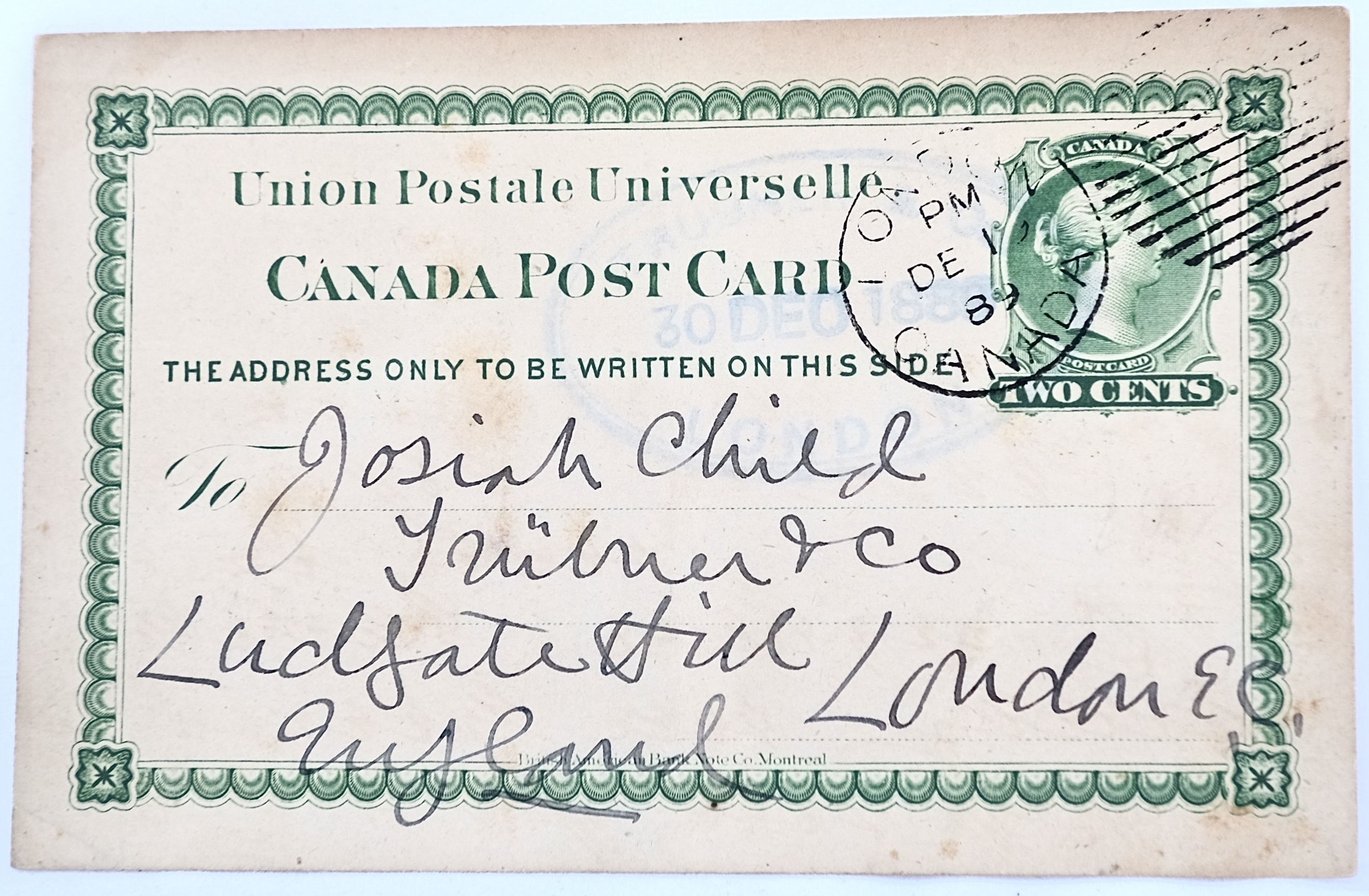
But it was the advent of the “divided back postcard” that perhaps best defines the height of the Golden Age of postcards. Beginning in 1902 in Great Britain, 1903 in Canada, and 1907 in the United States and Japan, the divided back postcard featured an image on one side and split the backside of the card so that senders could record their message on one half of the card and write the recipient’s address on the opposite half. This left the image side of the card unencumbered by borders or written text – a perfect arrangement for collectors.
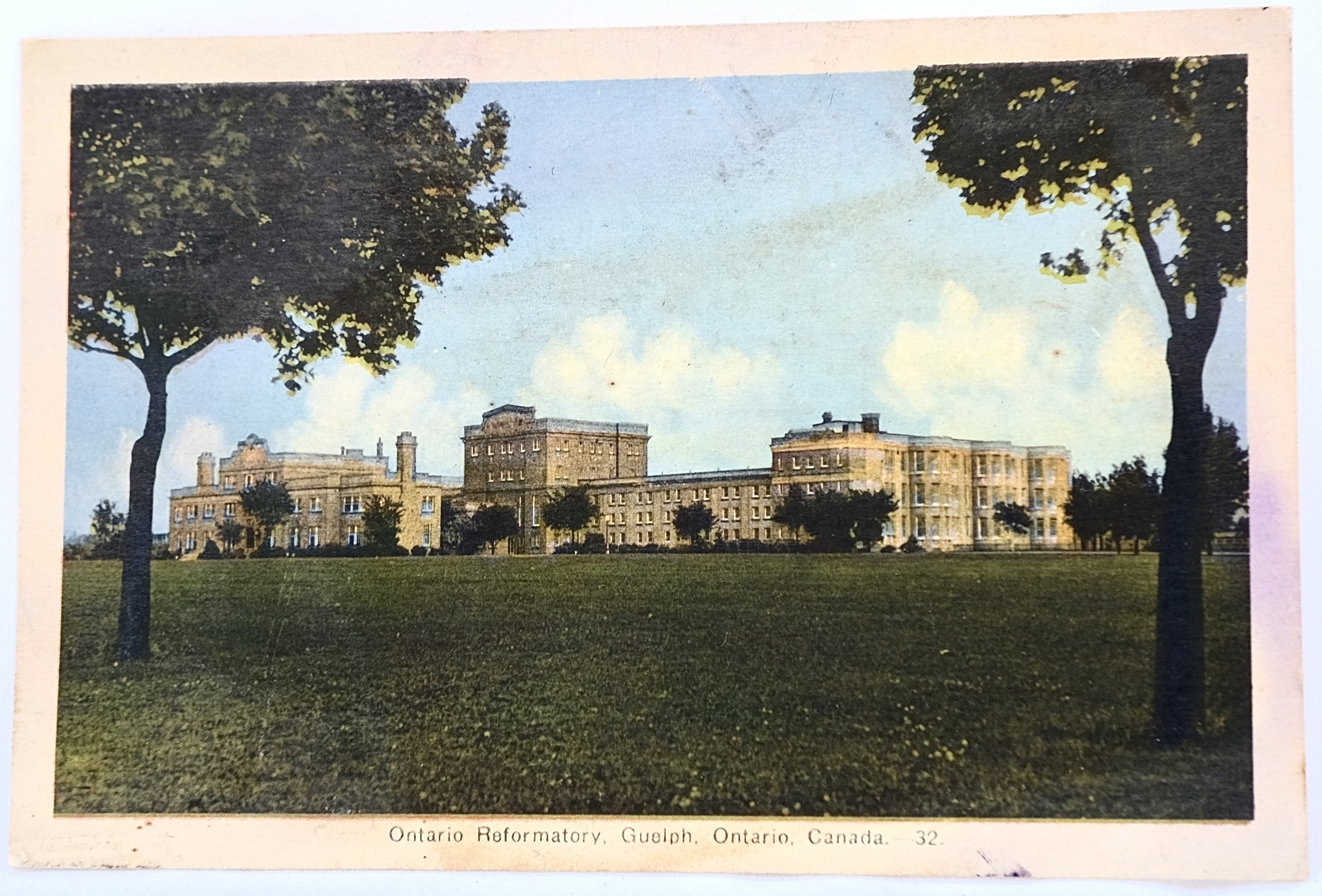
The Asylum Postcard
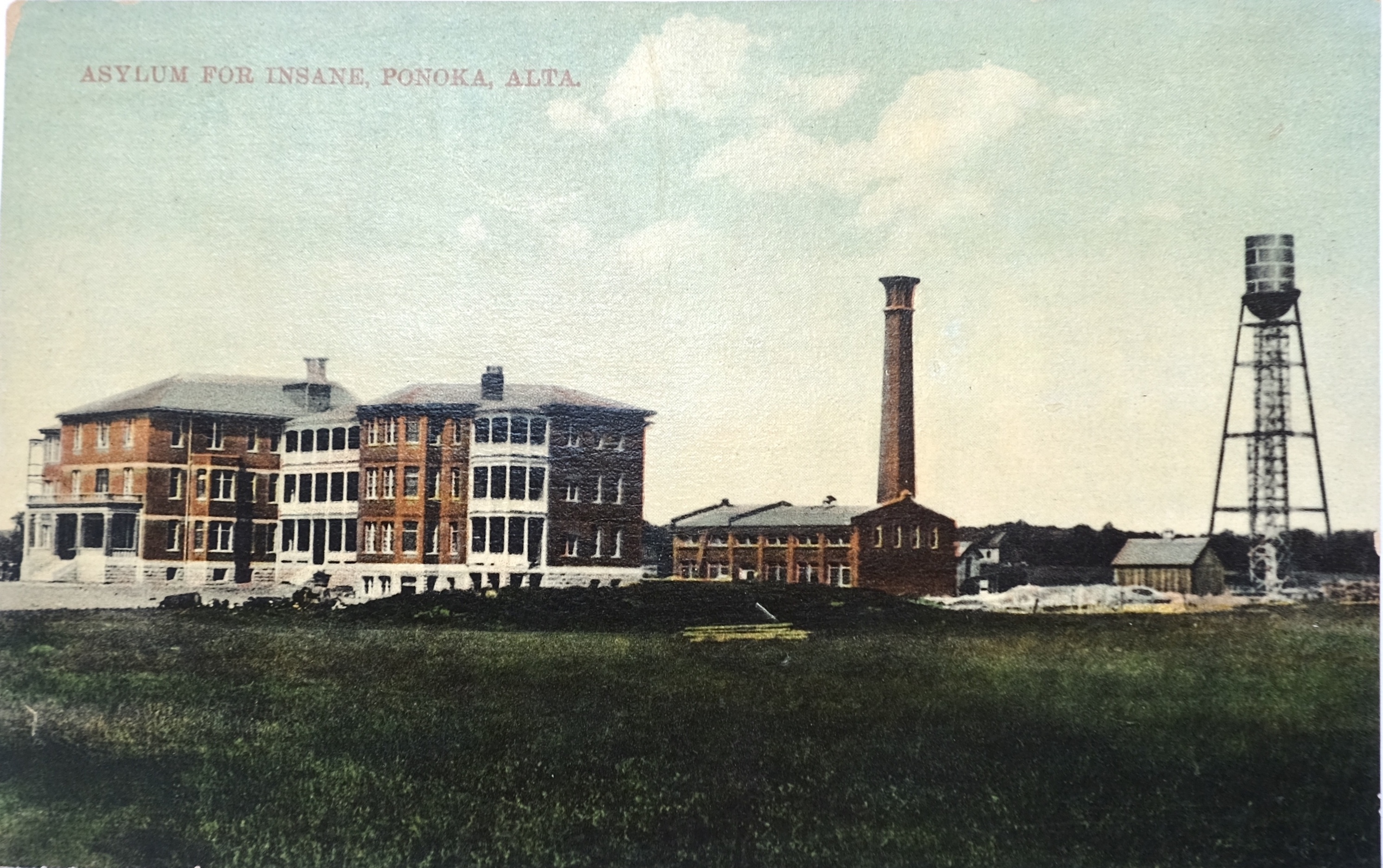
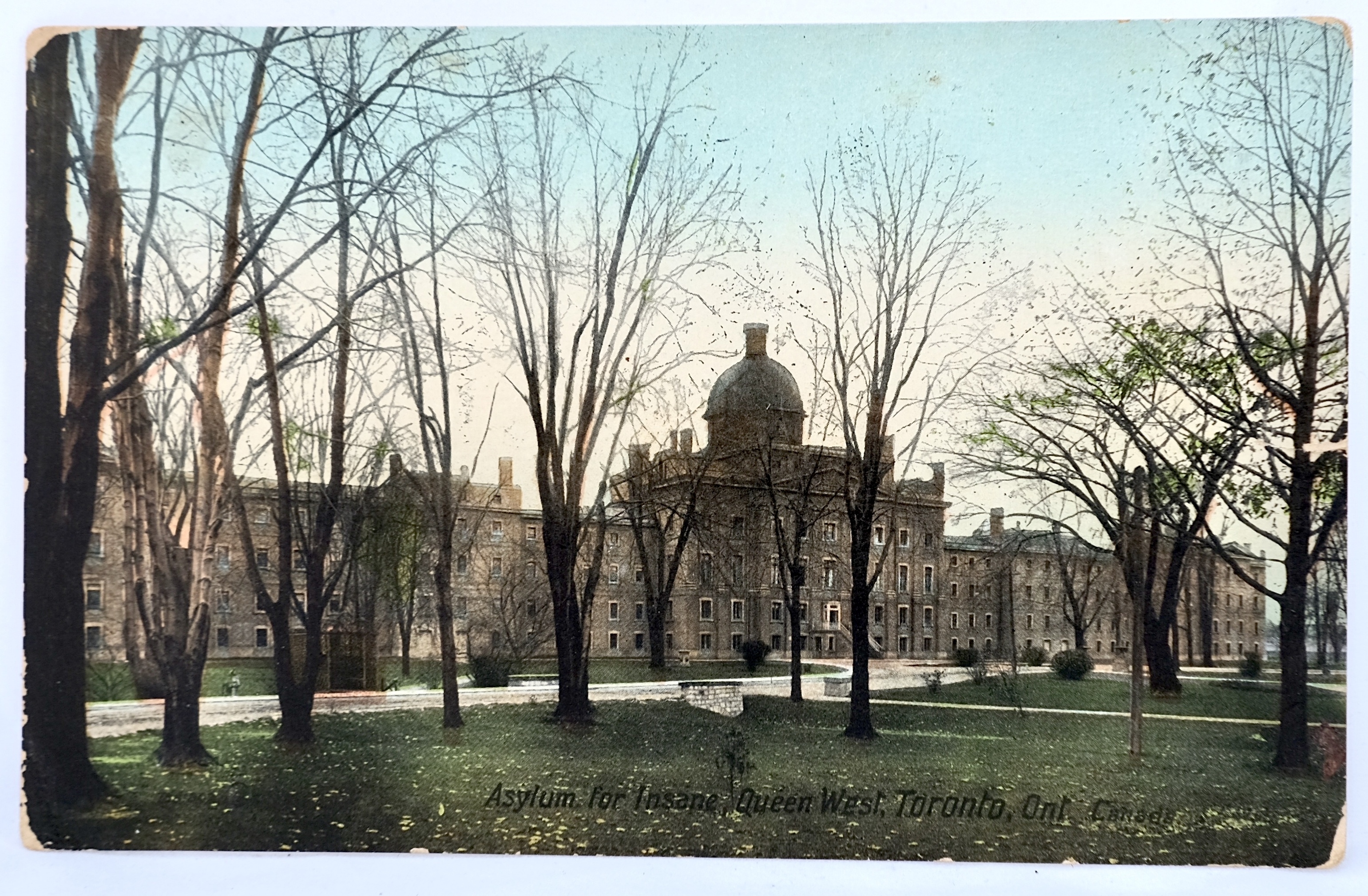
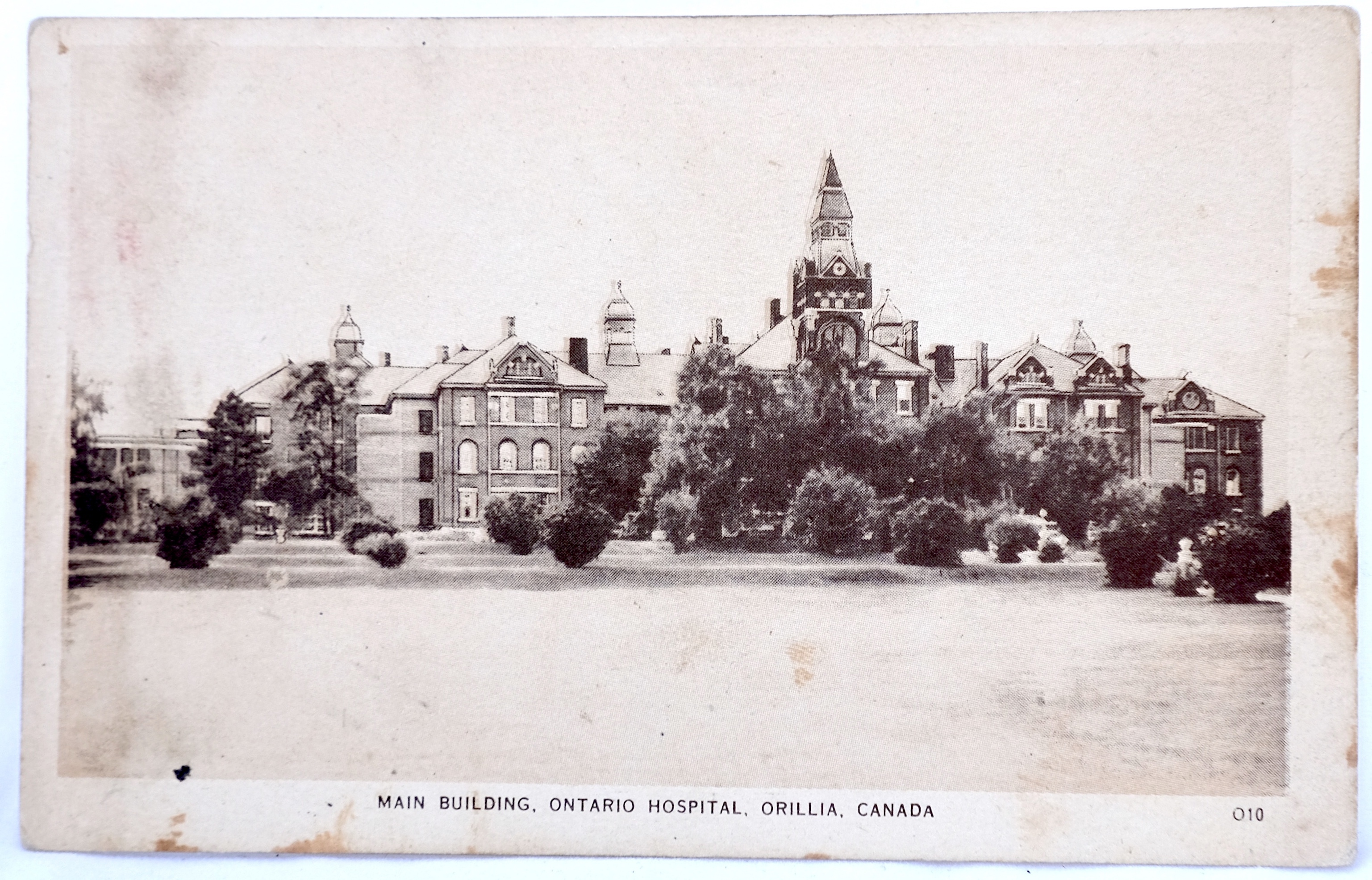
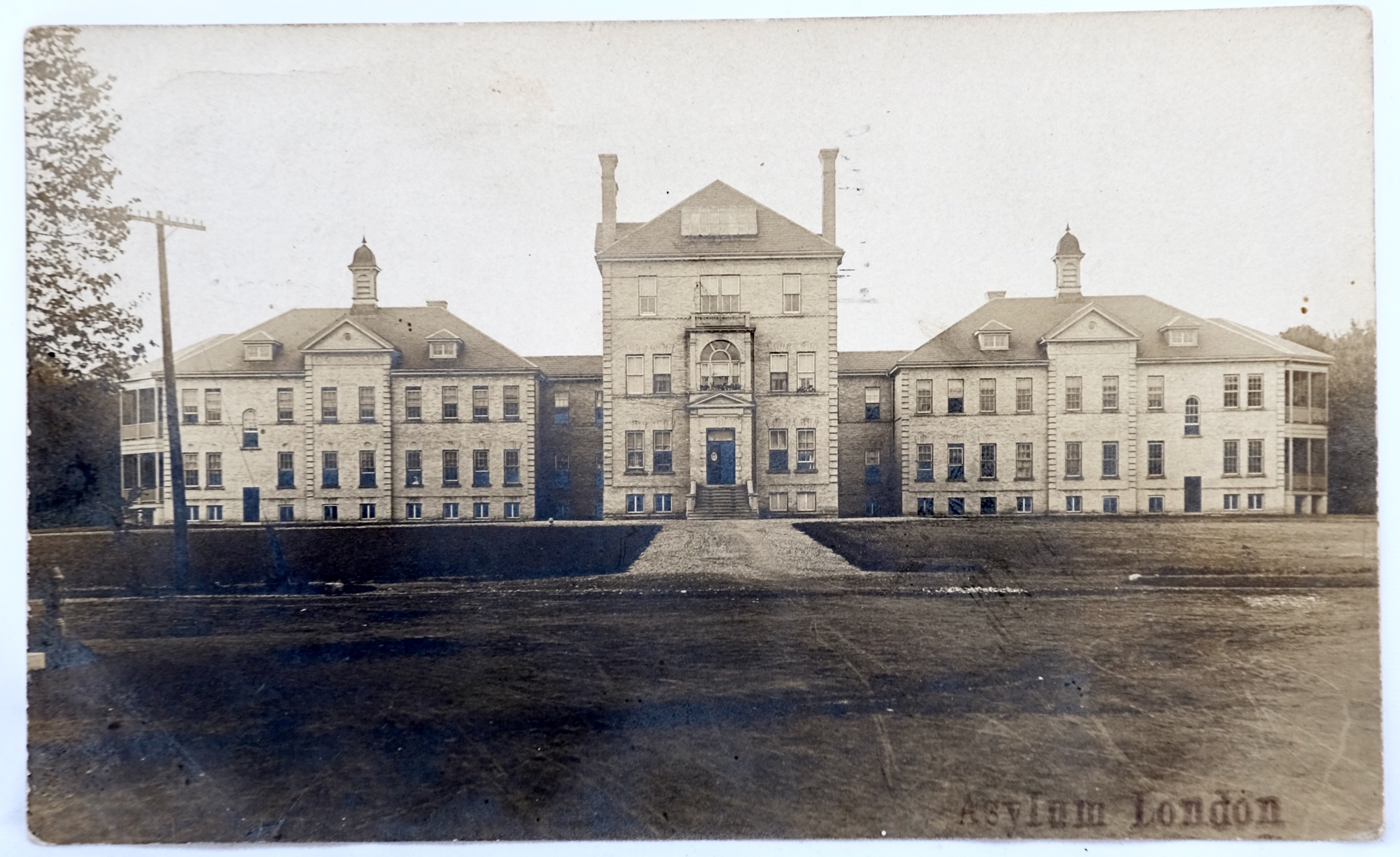
photo.description
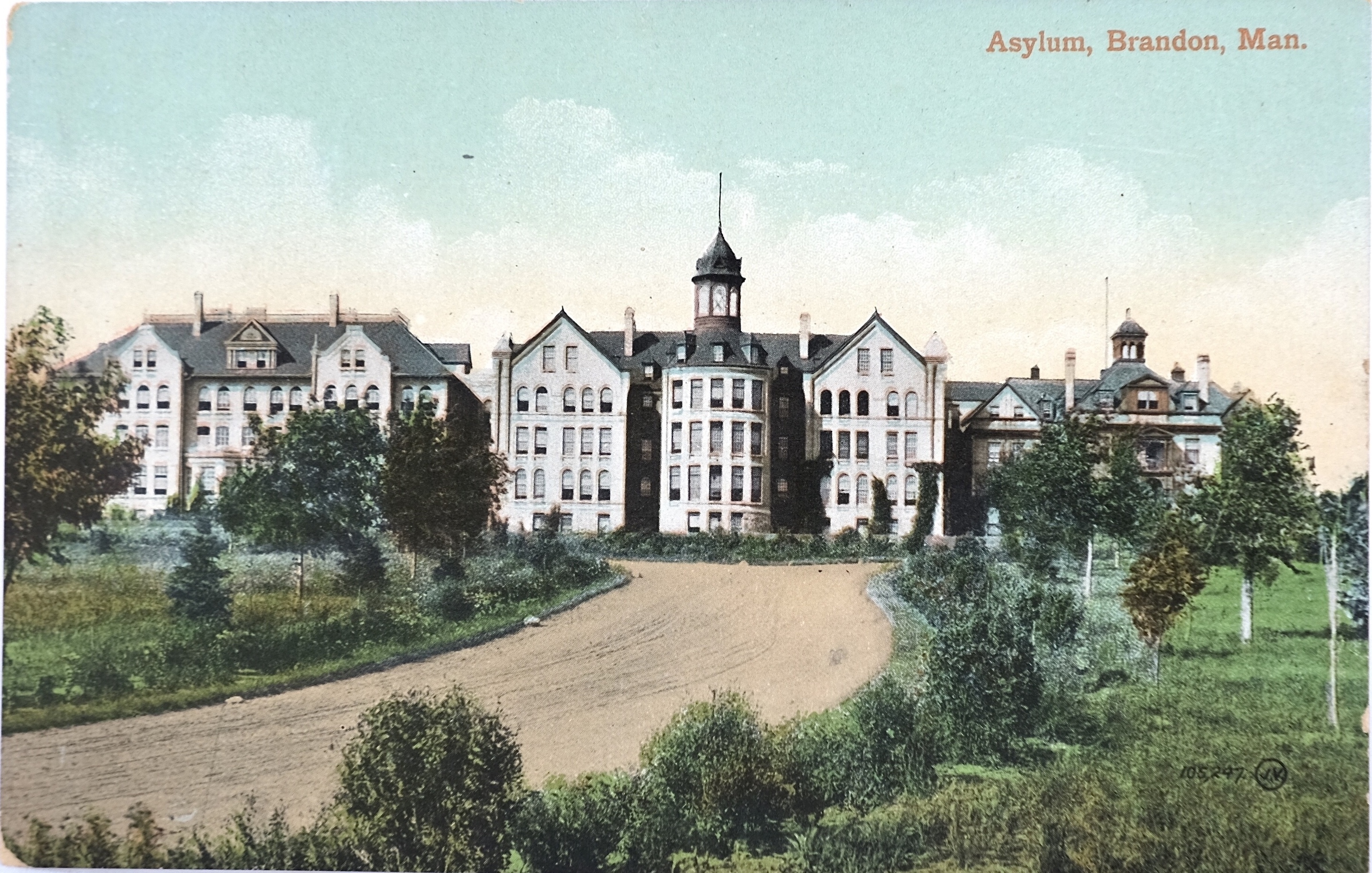
photo.description
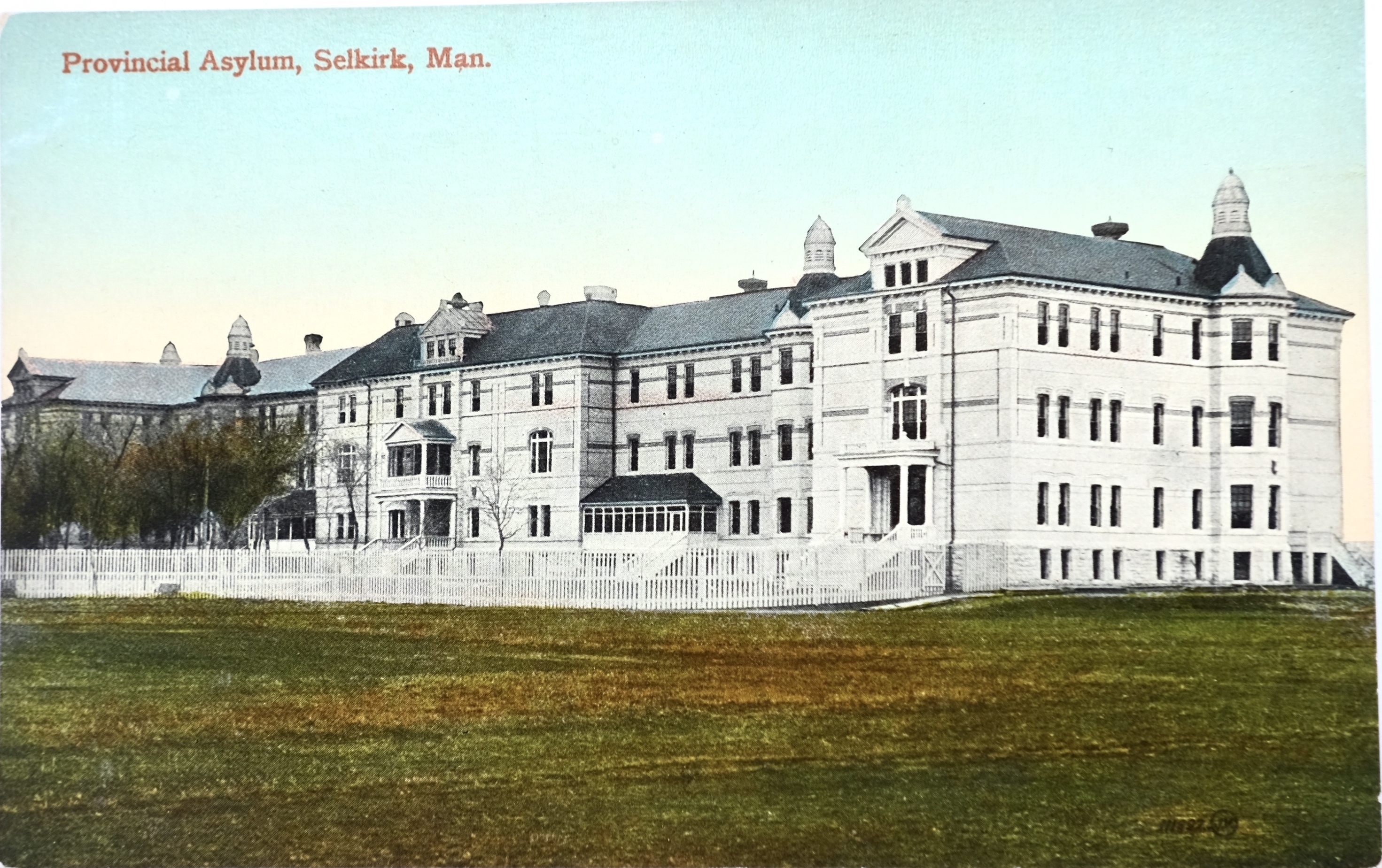
photo.description
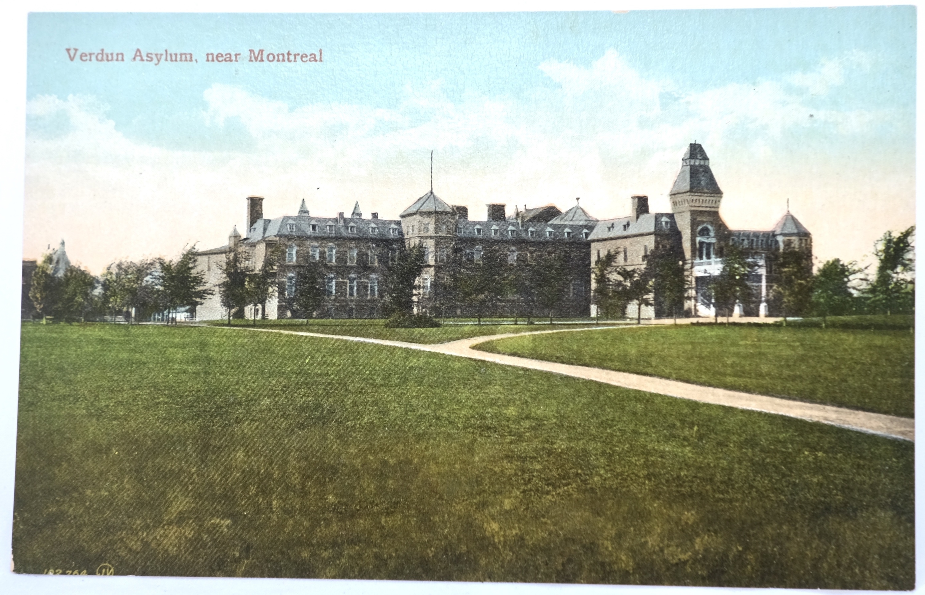
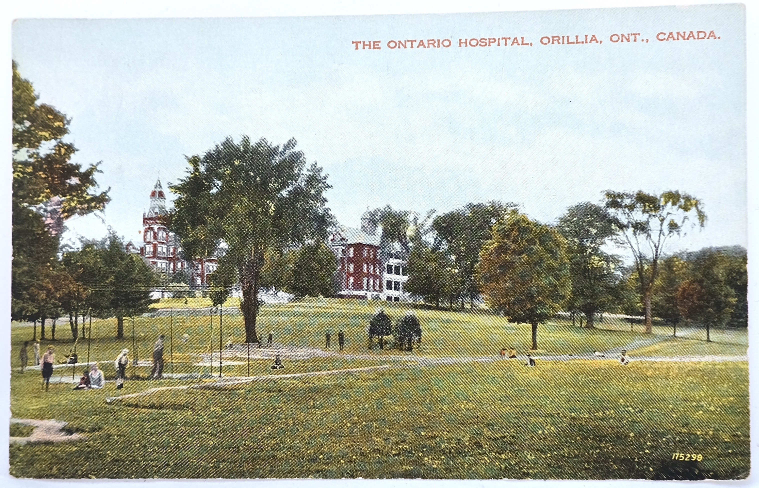
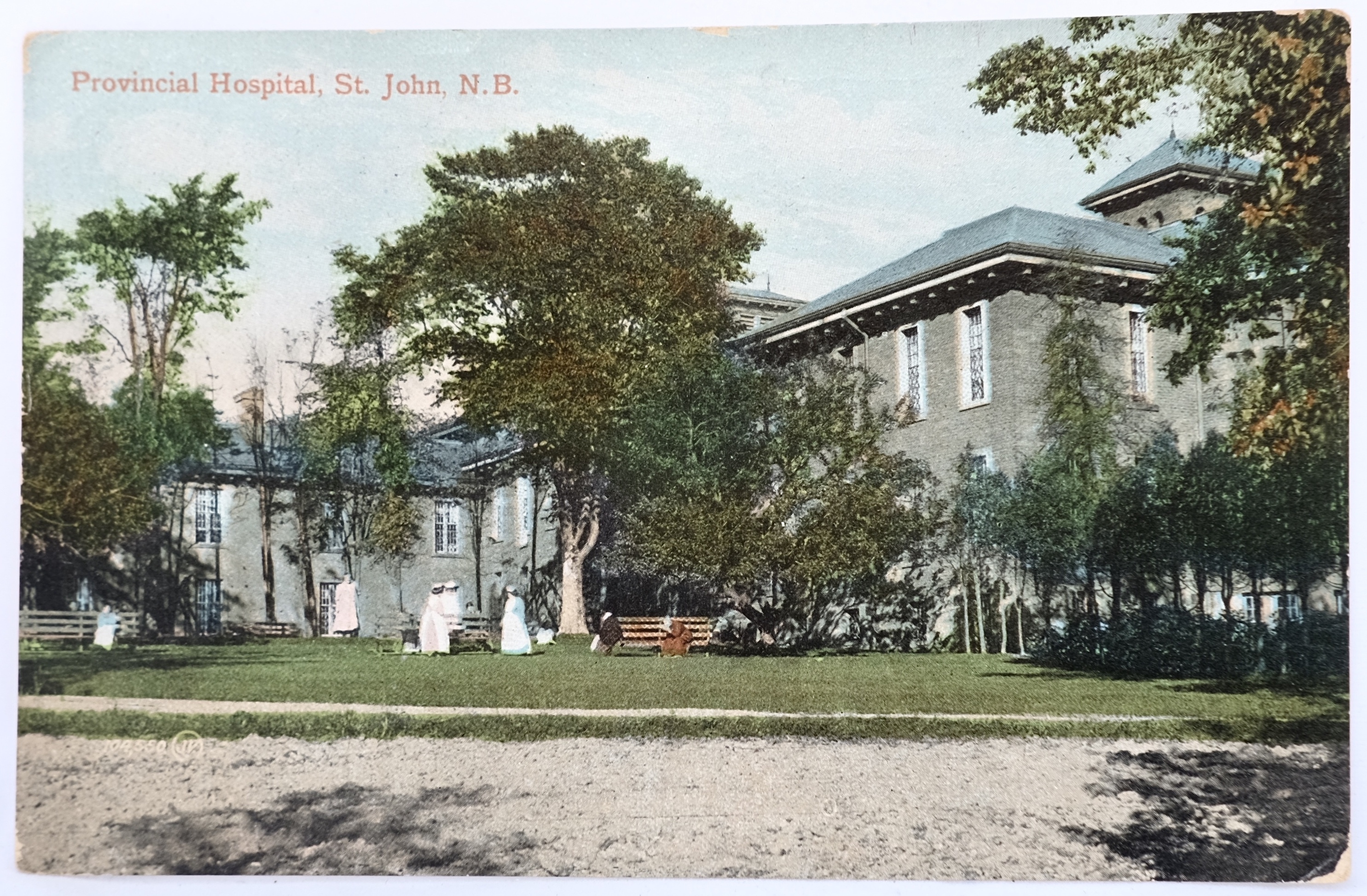
The majority of asylum postcards were published in the early twentieth century during the Golden Age of Postcards. Their images are typically unremarkable compared to other popular cards of the era: they most often feature a view of the institution’s building(s) set on a large manicured lawn. Aside from the name of the institution which typically appears in the corner of the image, there is no obvious difference between the asylum postcard and that featuring any other public institution.
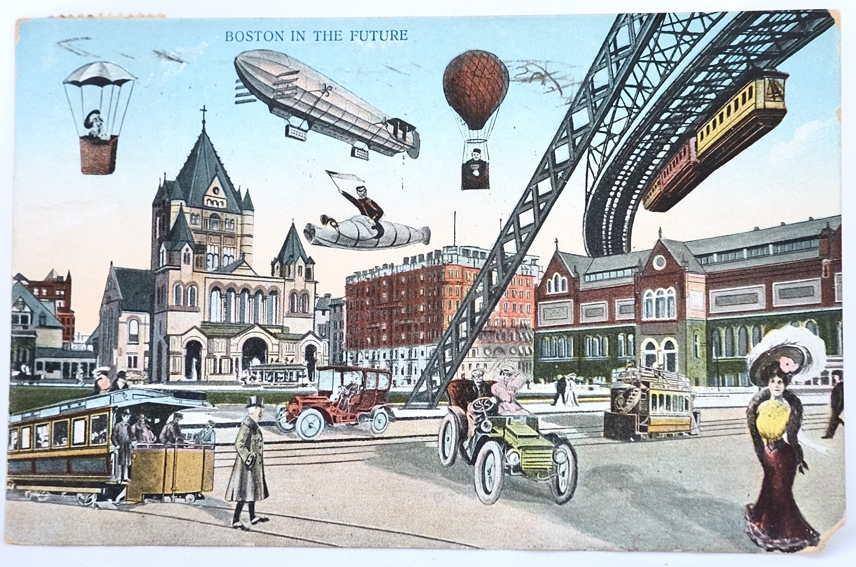
There were many, many different subjects that were popular during the Golden Age of postcards – you could find anything from views of the main street in a chosen town, to the counties’ largest pumpkin, to projections of what the world might look like in the future.
Asylum postcards fit in the category of institutional picture postcards: cards that feature images of the public institutions a particular community had within its boundaries. In the early twentieth century, public institutions – be they schools or asylums – featured aesthetically attractive architecture, large manicured lawns, and beautiful gardens. In other words, they made for a “pretty picture.”
For their part, asylums were not simply on trend architecturally with their fellow public institutions but had been purposefully designed to be beautiful spaces. The philosophy of “moral treatment” on which the Western asylum era was established, emphasized the crucial role that the physical environment played in the healing process. Asylums, therefore, tended to be located
on the outskirts of town on large expanses of property. Their physical structures featured an abundance of windows to allow in natural light and long corridors to permit air to flow easily through the spaces. Their grounds were likewise carefully planned with walking paths laid out amongst elaborate gardens and orchards.
To the casual visitor to the community, the buildings were impressive, eye-catching, and were even featured in local tourist guides. To those confined in the role of patient, the impression - and experience - could be quite different.
This visual arrangement attracted both visitors and photographers. Whether an individual had any interest in the institution itself, the institutions made for a pretty postcard. These portrayals indicate that local asylums played an important role in the communities where they were located, but much about the experiences of those within their walls remained obscured behind the impressive facades.
Community Insight
Asylum postcards were not produced by the institutional administration but instead by local photographers and major postcard publishers. They were not sold at the institution itself or made available to patients or staff. They seemed instead to be a reflection of local pride in the institution's architecture and grounds, without delving too deeply into its function. As such, they were hardly distinguishable from postcards of any other public institution.
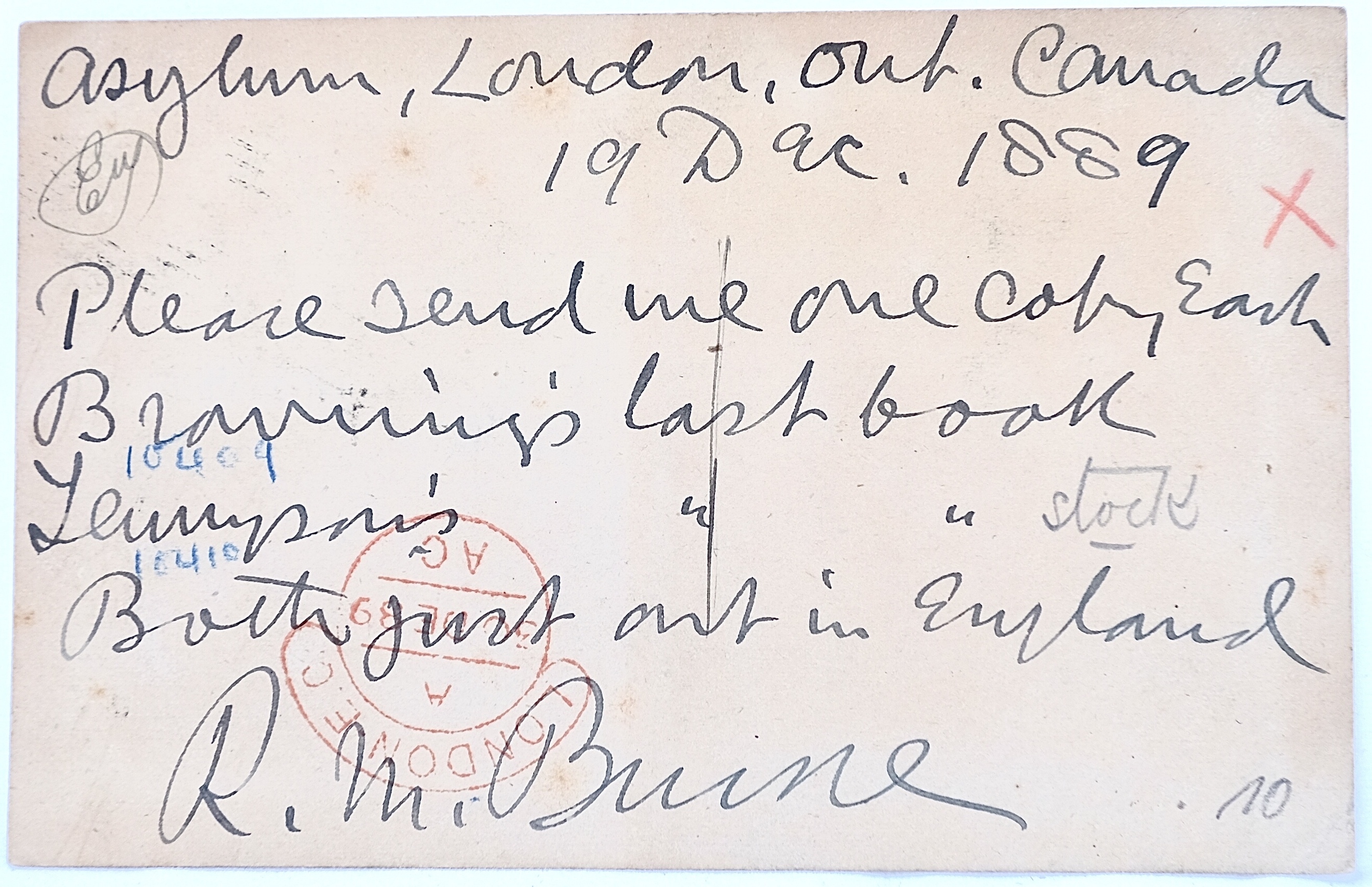
Perhaps public sentiment revealed itself in the written messages? Curiously, most asylum postcards boast no mention of the institution in the written messages of senders. Like a postcard featuring any other image, senders reported their travels, updated their plans, reported personal or family news, or simply sent a note to say “hello.”
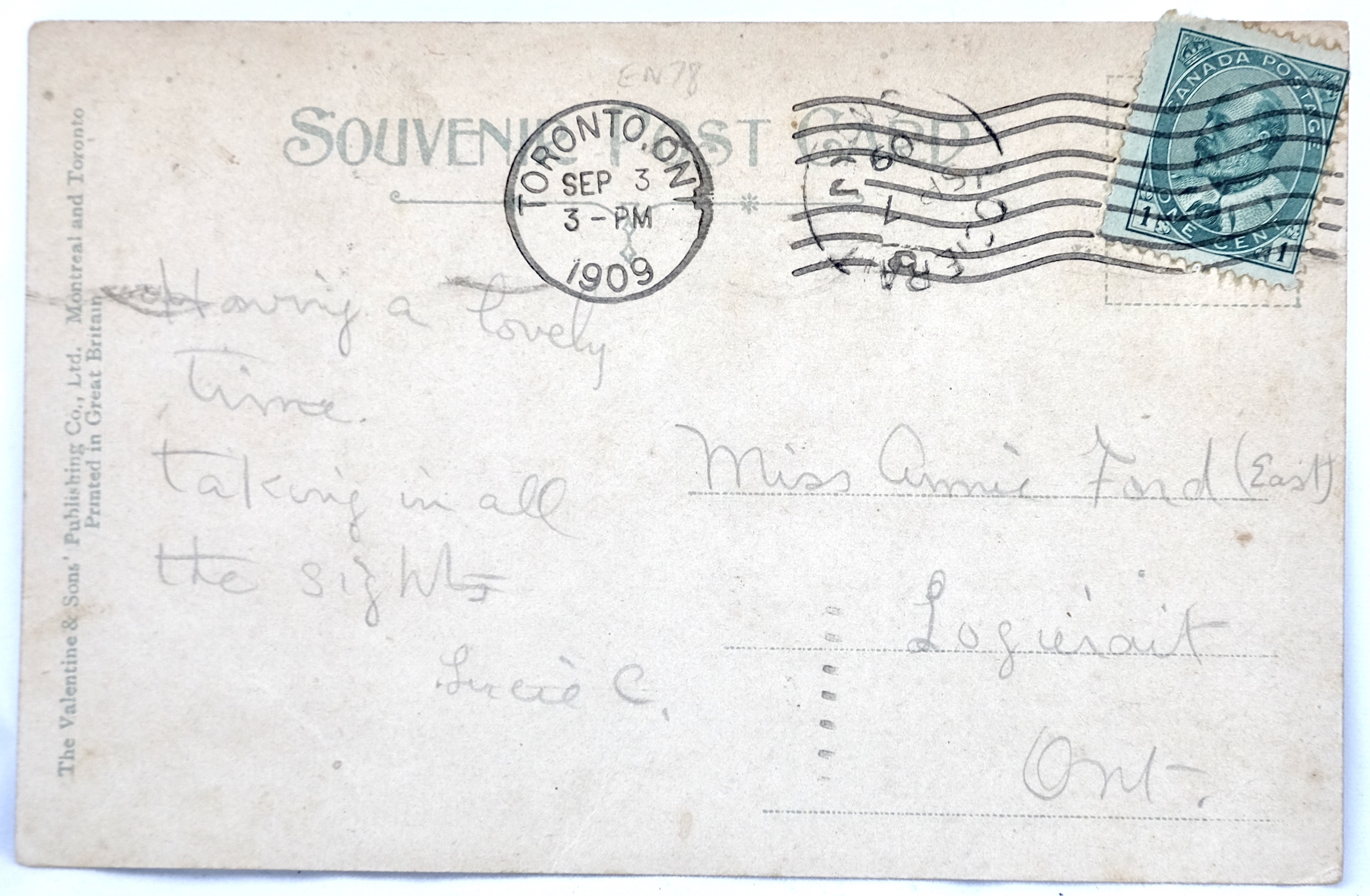
“Having a lovely time.
Taking in all the sights.”
“I wish you would write and let me know how you are getting along and when you are coming down.”
Of course, no rule is ever set in stone and occasionally a collector will find a message that refers to the institution. These tend to either be personal references “I worked here” or a demeaning or even threatening comment about mental health:
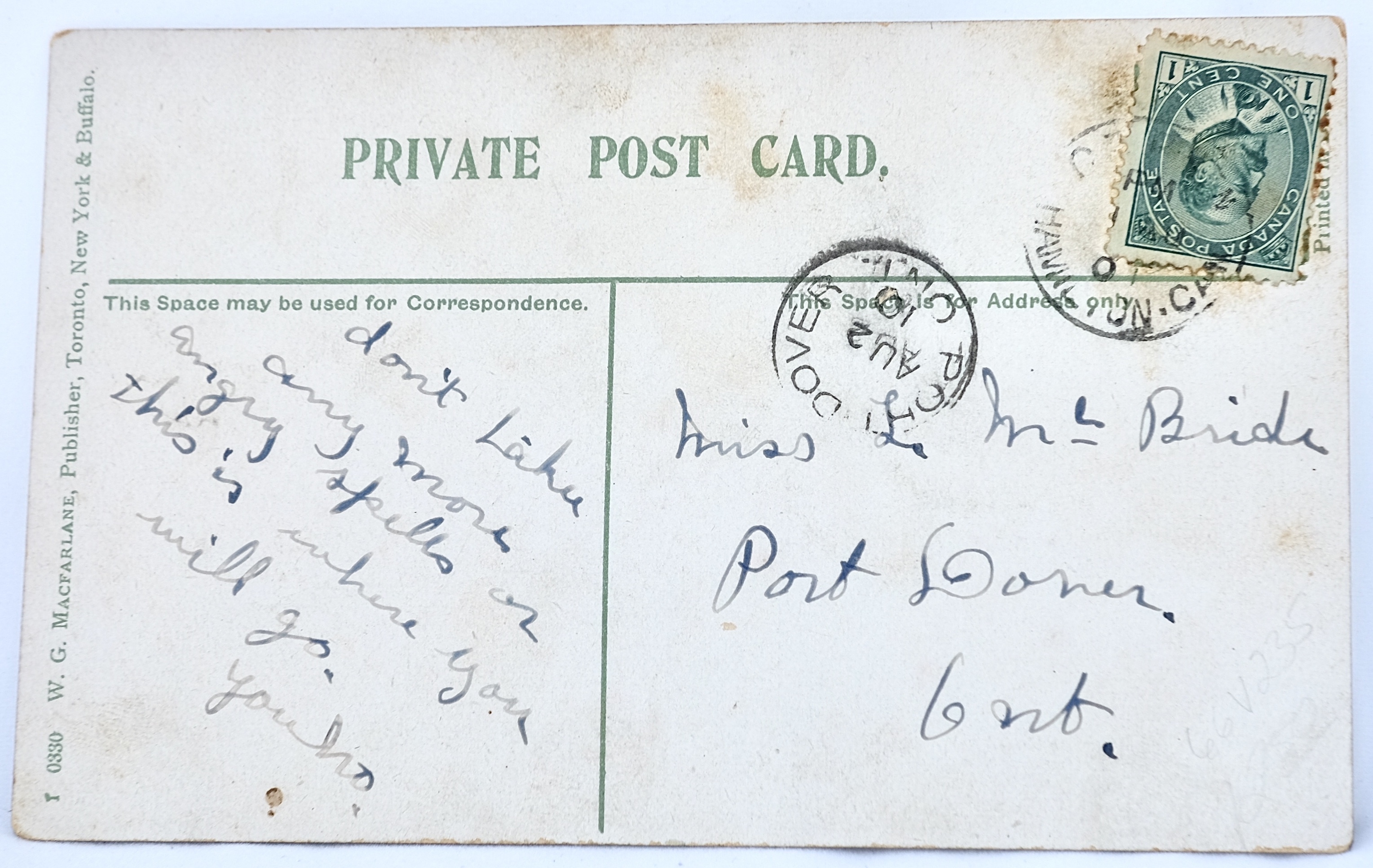
“Don’t have any more angry spells or this is where you will go.”
“How do you like this place for a home, the address of it is 999 Queen West. Thought you might need it some time, no offense [meant?] dear Brother.”
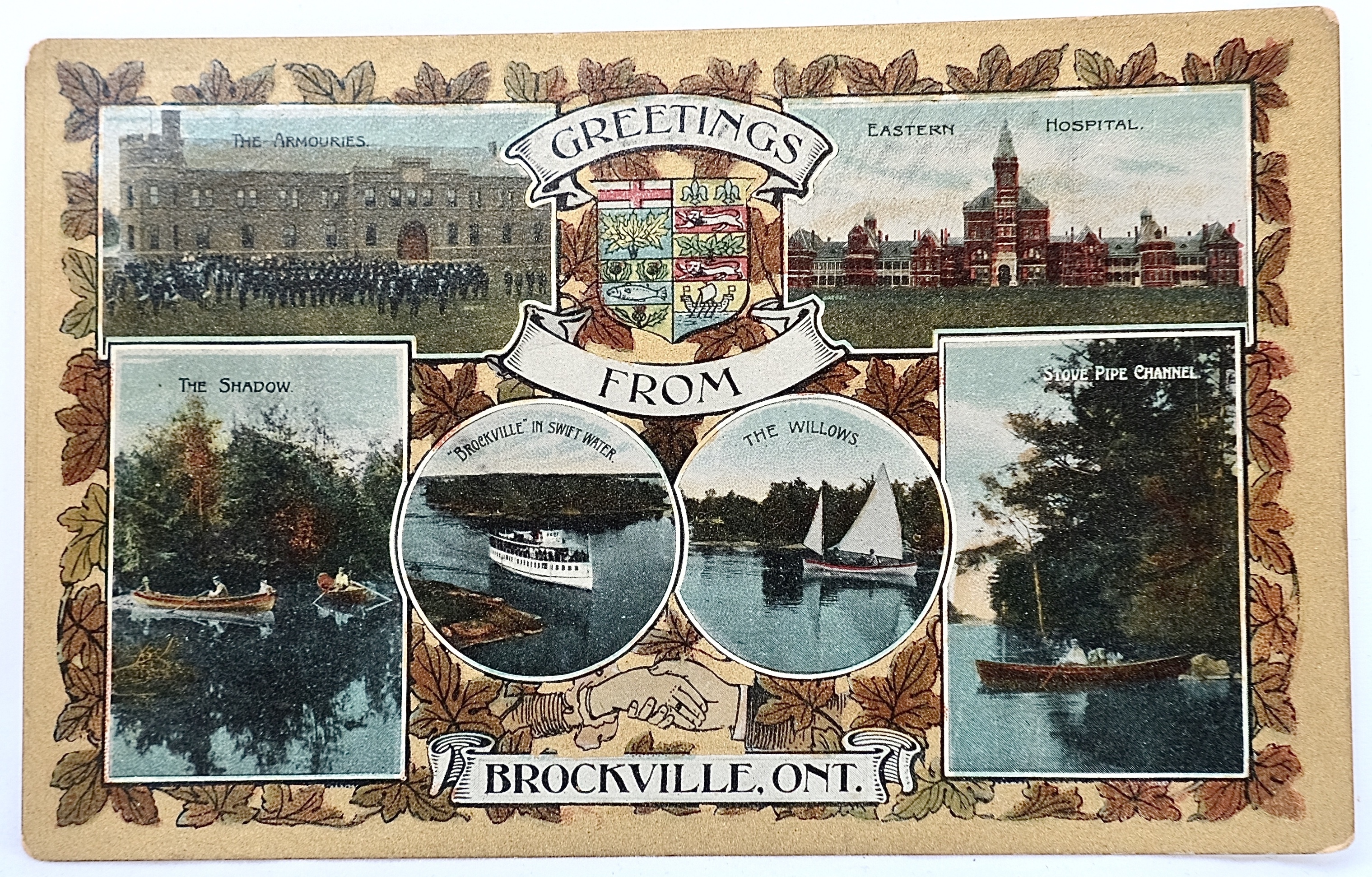
The commonality of the asylum image on picture postcards is perhaps best illustrated by the inclusion of the asylum in the multiview postcards of a city or town. Multiview postcards feature multiple images in a collage format on the picture side of the card. For cities and towns, this was often a way to represent their best features: main street, the best vista over town, and the large architecturally-interesting public institution.
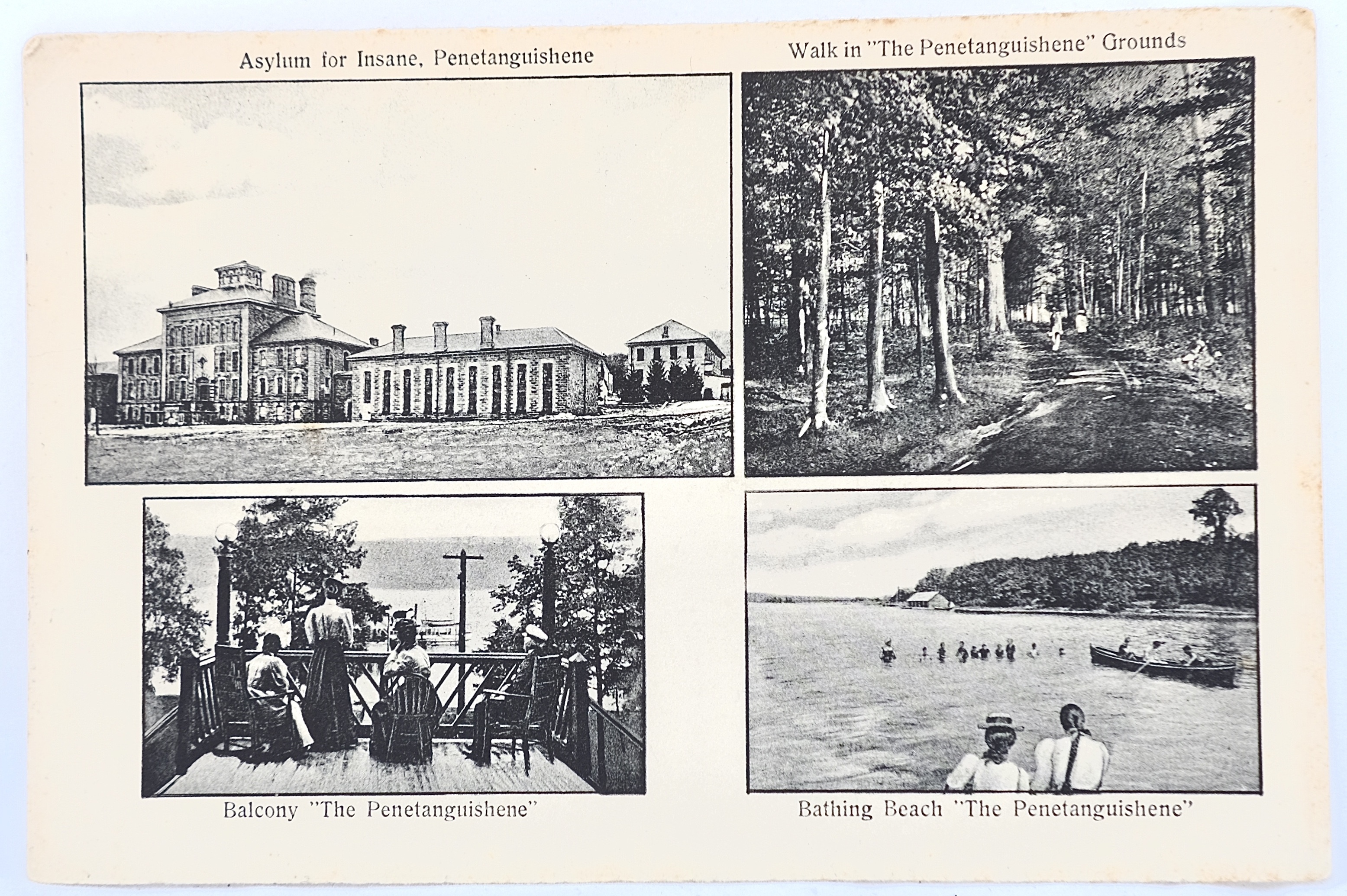
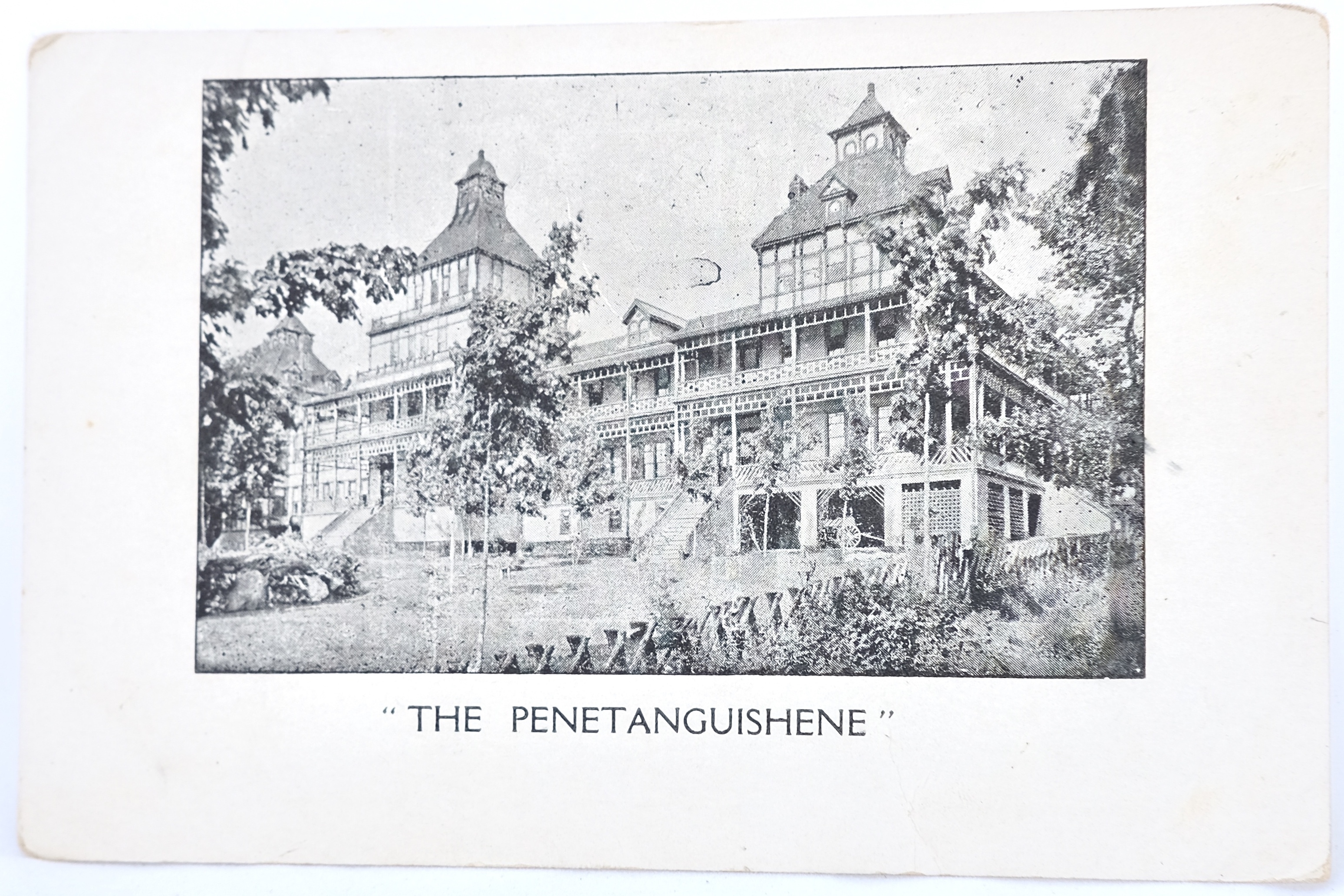
One multiview collection that has always puzzled me is from Penetanguishene, Ontario. Located on the shores of Georgian Bay, this picturesque area of the country has long been a popular destination for cottagers. One multiview postcard for the area features four images with captions: (1) Walk in “The Penetanguishene” Grounds; (2) Bathing Beach “The Penetanguishene;” (3) Balcony “The Penetanguishene;” and (4) Asylum for Insane, Penetanguishene The Penetanguishene was a popular summer hotel for visitors to the area: three of the images feature its grounds. The hotel itself was likewise beautiful and architecturally impressive. Why, then, feature an image of the local asylum building, and not the hotel itself, on the postcard? It is a mystery I am still exploring. The experiences of hotel guests and asylum patients could not have been more disparate.
Additional Picture Features
People
One of the most surprising elements of asylum postcards is the lack of people. By the early twentieth century when postcards were at their heyday, asylums were more often than not in a state of crisis with regards to being overcrowded. The lived experience of people housed within was far from calm. And yet, the images that grace postcards are most often exterior photographs of some combination of the buildings and the grounds – with few people to be seen.
Where people do appear, they are never the focal point. How should viewers, and researchers, interpret these idealized images?
Names
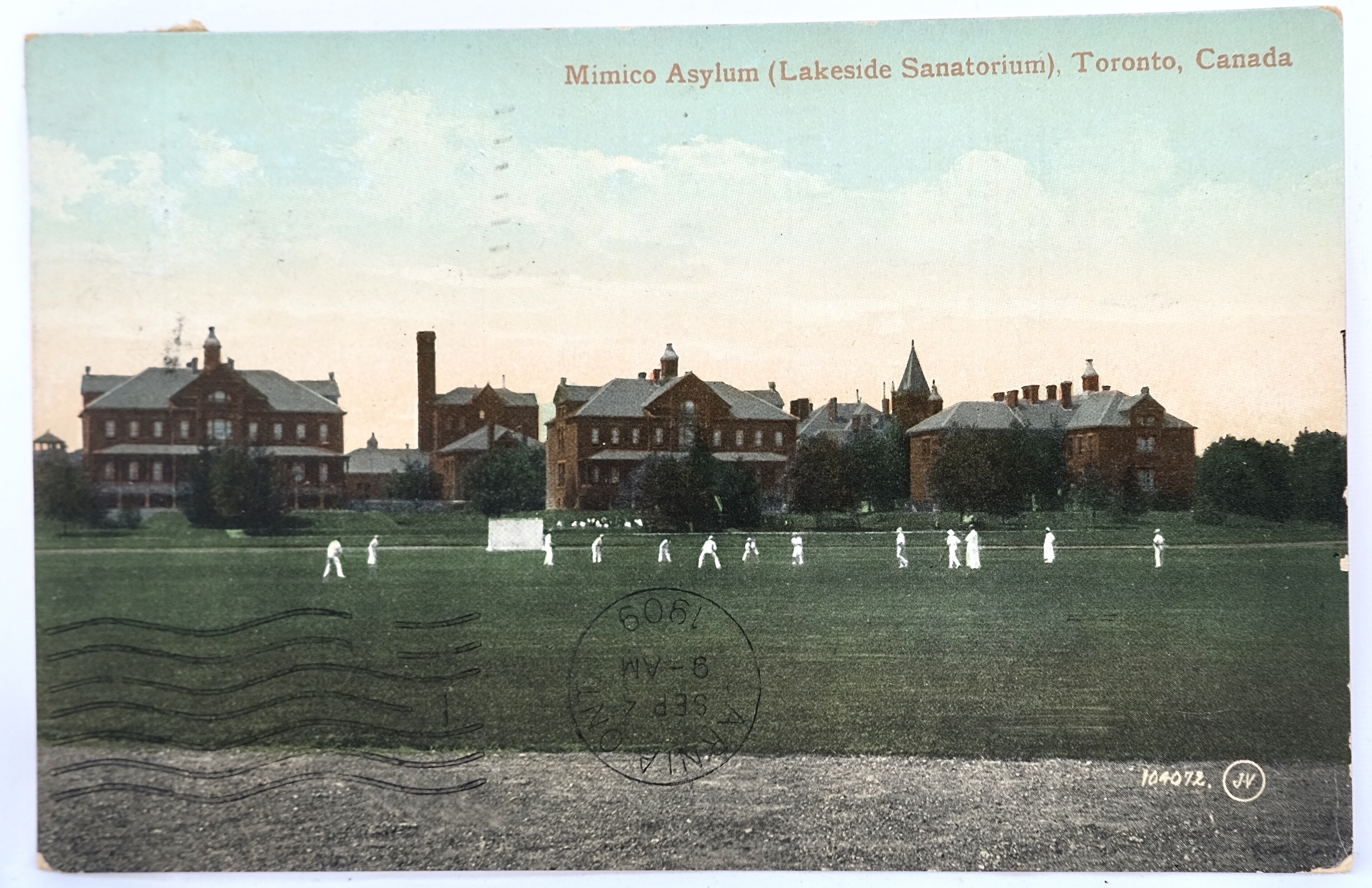
Collectors and researchers alike need to be careful with the text that appears on asylum postcards. The cards were created by postcard publishers and photographers – not by the institution’s administration. As such, errors regularly appear in the printed name of the institution. Most often, the name is simply outdated for the time period: using “asylum” rather than the transition to “hospital,” for instance. Other times, the name is completely inaccurate as is the case of the Mimico Asylum: one of the two Valentine & Sons cards that were printed of the institution list the name of the facility as the “Lakeside Sanatorium” – a title it never held in its 89-years of operation and yet one that gets repeated now in historical essays about the site.
Presumed Rarity
One of the biggest challenges for a collector is that there is little information on the print runs for postcards. Handbooks and catalogues detail the variety of pictures that were created by a particular publisher and provide valuable information for dating the cards, but they offer no insight as to the amount printed of any particular postcard.
The collector then works from a presumed sense of rarity that is based solely on what is available on the market. A number of factors are at play ranging from the types of cards that were purchased at the time they were originally issued, the continued existence of the cards themselves more than a century after they were posted, and the regional location of the collector (even with the advent of online auction sites, in my experience it remains easier to find postcards local to one’s province / state than for those located further afar).
A case in point: more than 95% of the Canadian side of my collection features institutions from the province of Ontario. This inflation is due in part to the fact that there were exponentially more asylums in the province than in any of the other provinces combined (a prevalence somewhat similar to the number of asylums in the state of New York as compared to the other states). But the hardest postcard to find in the province should in theory be the most common: Toronto is the capital of the province, it was the first asylum to open in the province, and it was influential among its sister institutions – and yet, in my experience, it is the most difficult to find.
Were fewer postcards printed of the Toronto Asylum? Were fewer kept in surviving collections? Or were they simply lost in numbers in a major metropolitan city that had innumerable picture postcards available as compared to a smaller community where the institutional building was one of the major sites to see?
The Real Picture Postcard (RPPC)
One other variety of asylum postcard to introduce is the real picture postcard (RPPC): it consists of a photographic image printed directly onto postcard stock. These were often produced by local photographers and sold in smaller runs. A simple way to check whether a postcard features a photograph or a printed image is to use a magnifying glass: if the image is made up of a series of small dots, it has been printed; if there are not dots, you’re looking at a photograph.
Real Picture Postcards are less common than their printed counterpart, but they are well worth the search. They not only provide a different image of the featured institution from those repeated over and over again on the print cards but also occasionally offer either a fresh perspective or even access to a particular moment in time.
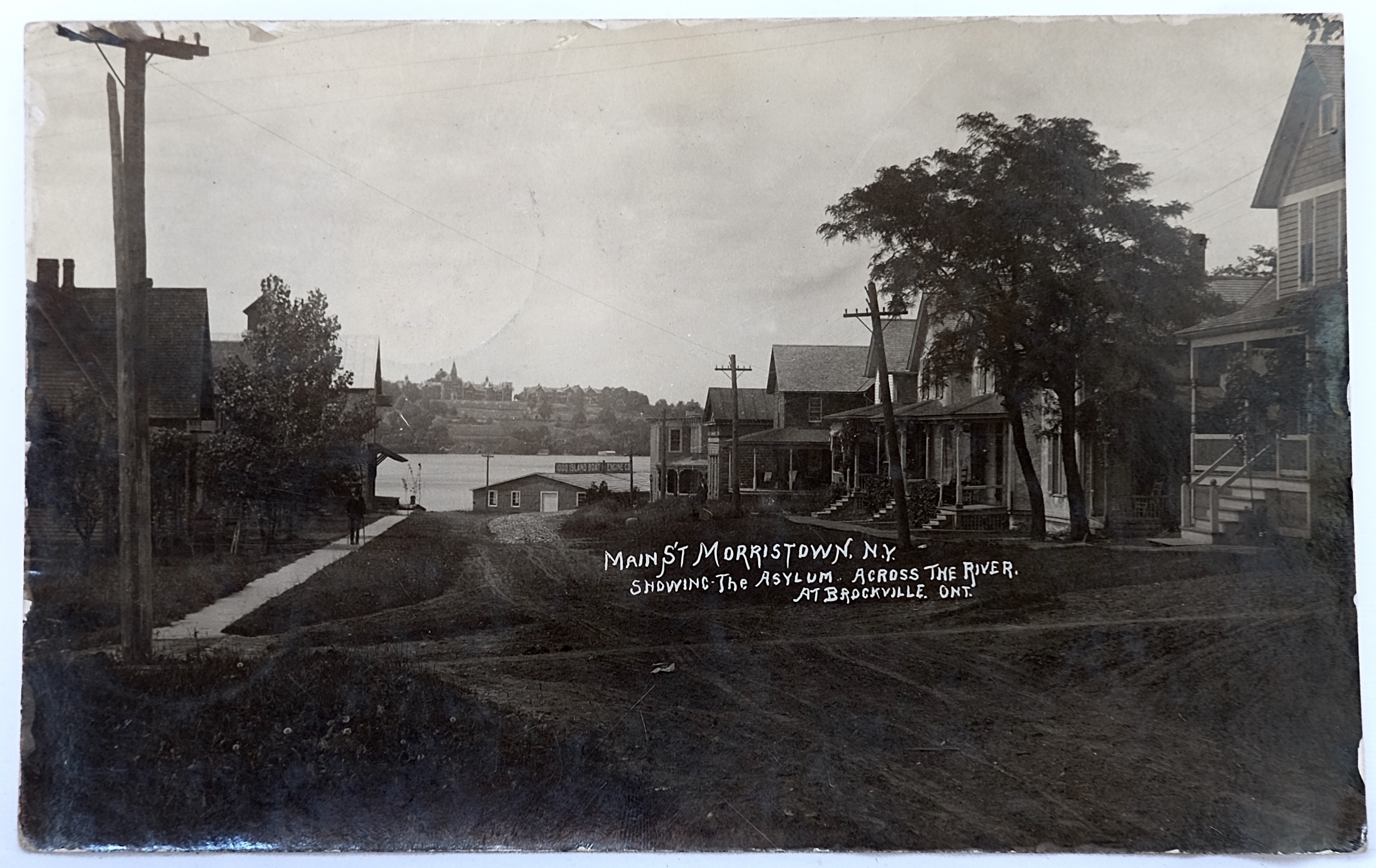
This view from Main street in Morristown, New York seems disconnected to an asylum postcard collection until the full text caption is read: “Main St Morristown, N.Y. showing the asylum across the river at Brockville, Ont.” A second look at the image reveals far in the distance of the view the distinctive peaks of a large, institutional building overlooking the banks of the river.
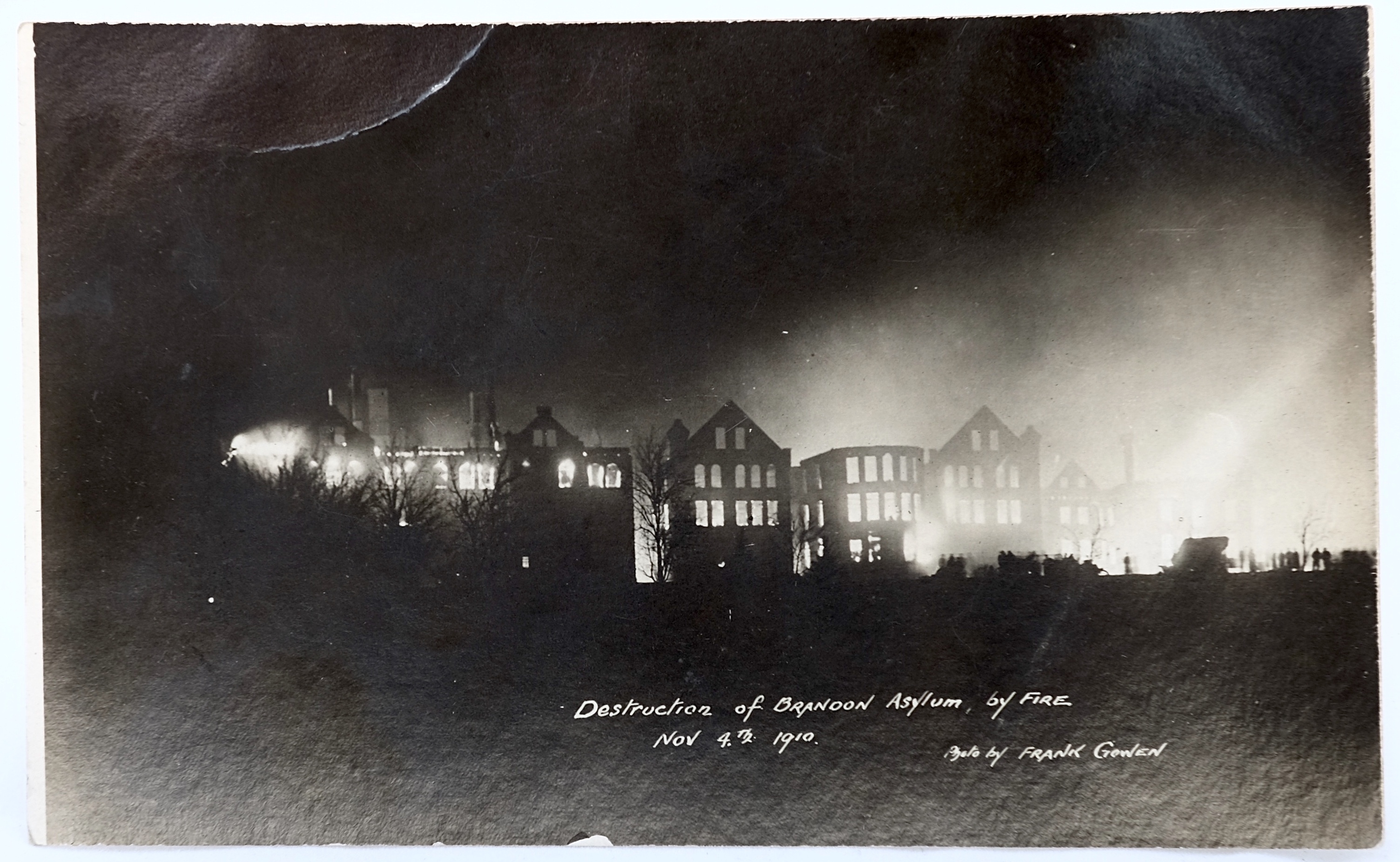
On November 4, 1910 the Brandon Asylum in Manitoba was destroyed by fire. In this real picture postcard, the flames can be seen still burning in the shell of the building while the silhouette of a crowd is barely perceptible along the bottom edge of the building’s footprint.
Explore Asylum Postcard Collections Online
Whether you fashion yourself a deltiologist or are simply interested in the visual record of asylums, there are a number of asylum-specific postcard collections available online.
The Center for the History of Psychology in Akron, OH holds two major collections of asylum postcards: those that form part of the David P. Campbell Postcard Collection and those that complement the Asylum Reports Collection from the Cushing Memorial Library.
The Eugenics Archive of Canada is a digital exhibit that explores the eugenic history of Canada. Their media collection includes a large collection of institutional postcards, including mental health asylums.
Read More about Asylum Postcards
Bogdan, R., & Marshall, A. (1997). Views of the asylum: Picture postcard depictions of institutions for people with mental disorders in the early 20th century. Visual Studies, 12(1), 4-27. doi: 10.1080/14725869708583772
Deese, A. W., & Faye, C. (2016). Nineteenth century American Asylums: A History in Postcards. Akron, OH: University of Akron Press.
Hook, S. A. (2005). You’ve got mail: Hospital postcards as a reflection of health care in the early twentieth century. Journal of the Medical Library Association, 93(3), 386-393.
Read More about Postcard History (in Canada)
Chronology of Canadian Postal History by the Canadian Museum of History: https://www.historymuseum.ca/cmc/exhibitions/cpm/chrono/chs1868e.html
Postal history and usages of the Canada Post card, 1871-1928. Exhibit from the British North American Philatelic Society: http://www.bnaps.org/ore/willson-post-cards.pdf
Toronto Postcard Club, Postcard Publisher Histories: https://torontopostcardclub.com/canadian-postcard-publishers/
VintagePostcards.ca: https://www.vintagepostcards.ca/eras/

Exhibit Curator and Author
Jennifer L. Bazar, Ph.D.
Lakeshore Grounds Interpretive Centre
Jennifer L. Bazar is the Curator of the Lakeshore Grounds Interpretive Centre at Humber College in Toronto, Canada. A long-time contributor to and collaborator with the Psychology’s Feminist Voices project, Jennifer’s main area of research is the history of mental health institutionalization.